Branding

EMED GROUP

Rebranding the UK’s foremost healthcare and specialist transport provider
EMED GROUP
EMED GROUP
EMED Group

Challenge

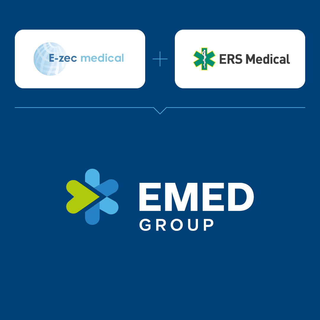
Following the merger of E-Zec Medical and ERS Medical, the newly combined company faced a critical challenge.

They needed us to develop a unified brand identity that would honour the legacy of both companies while setting a course for their future ambitions.

EMED Group

Solution

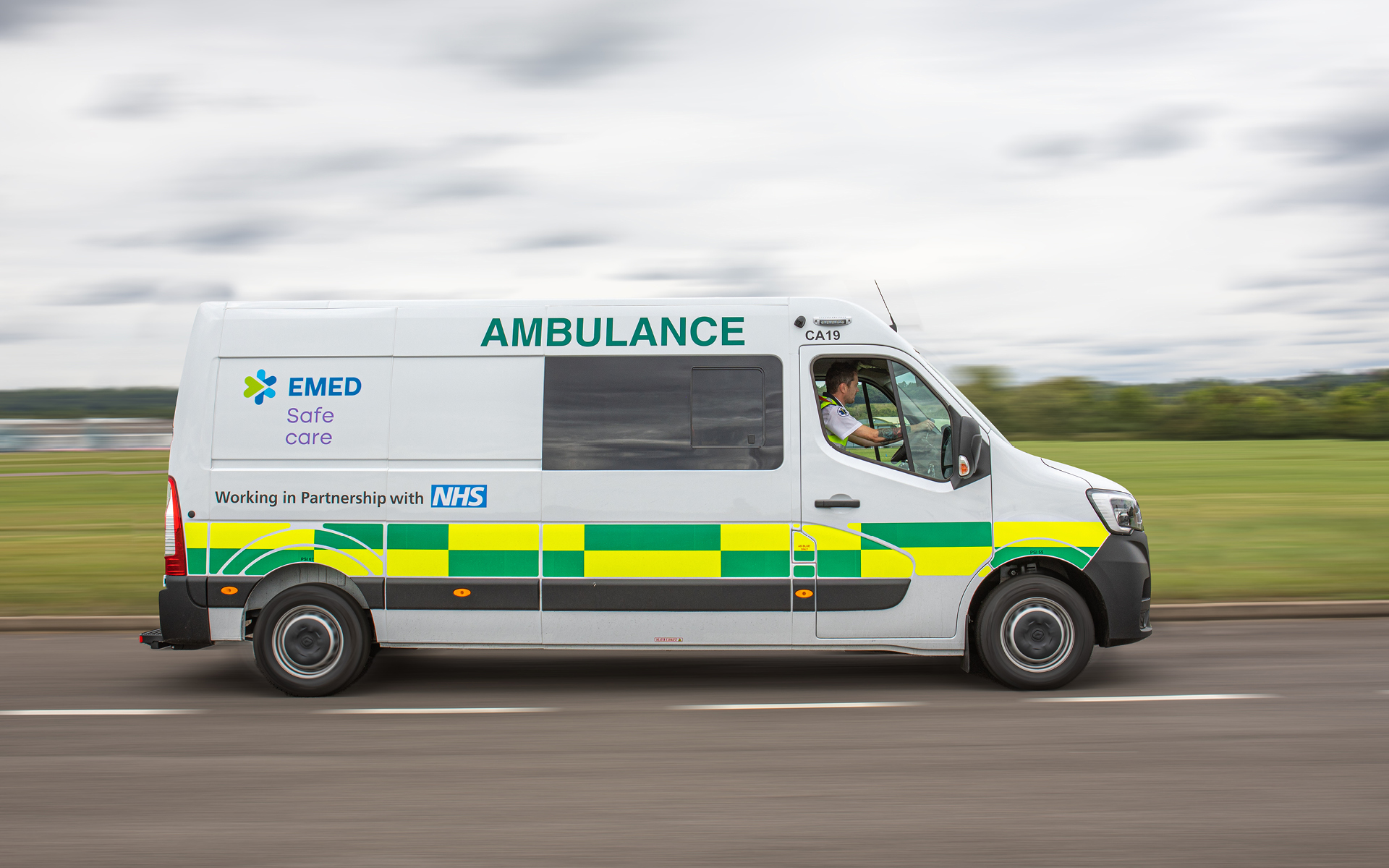
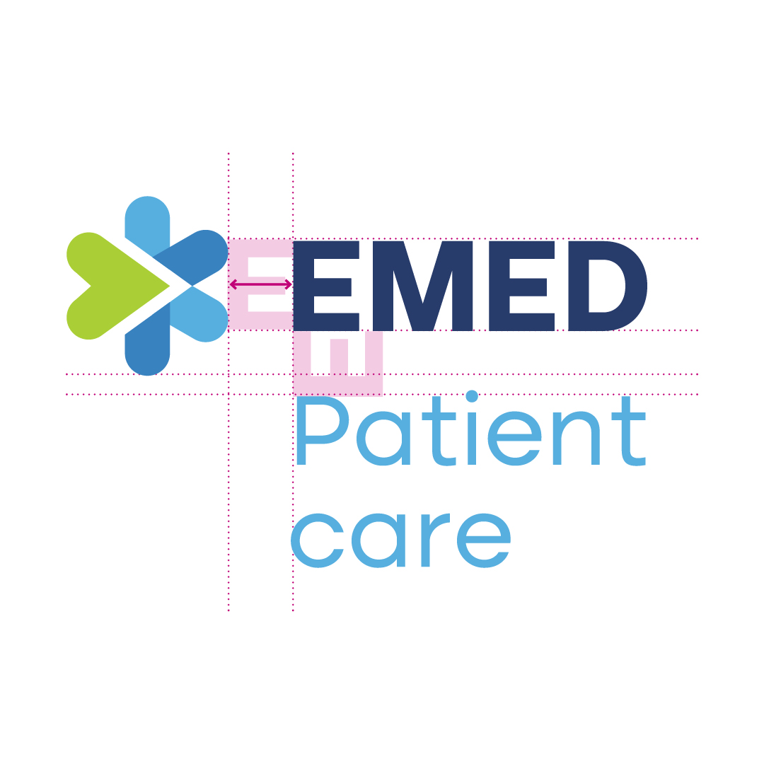
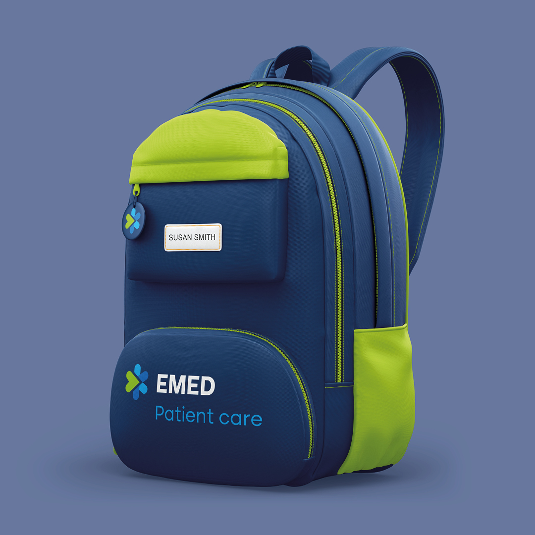
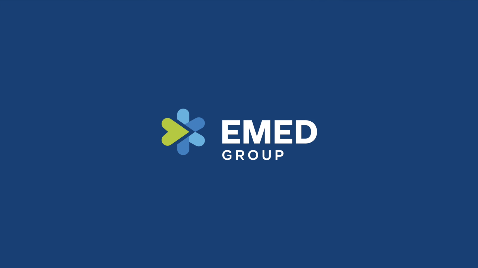
We created a new identity featuring a modified version of the star of life, now incorporating a forward-moving arrow shaped like a heart to symbolise the group’s dedication to care.

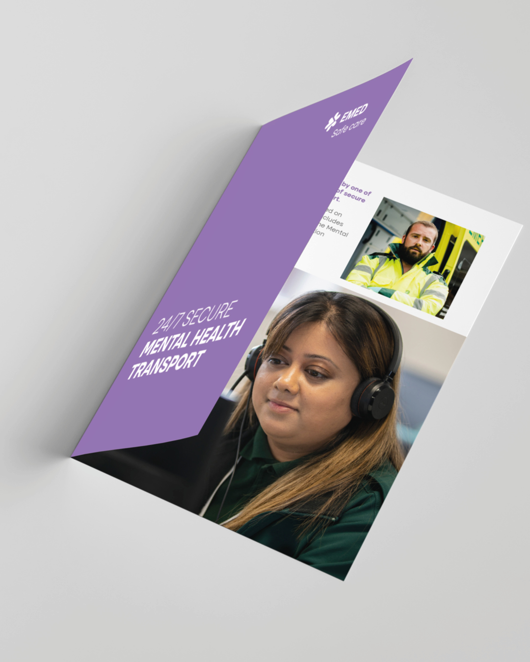
We also selected a more inviting and friendly typography to complement the logo. A significant part of the project was integrating sub-brands within this new brand architecture, ensuring both individual distinctiveness and cohesive unity under the group identity.

EMED Group

Result

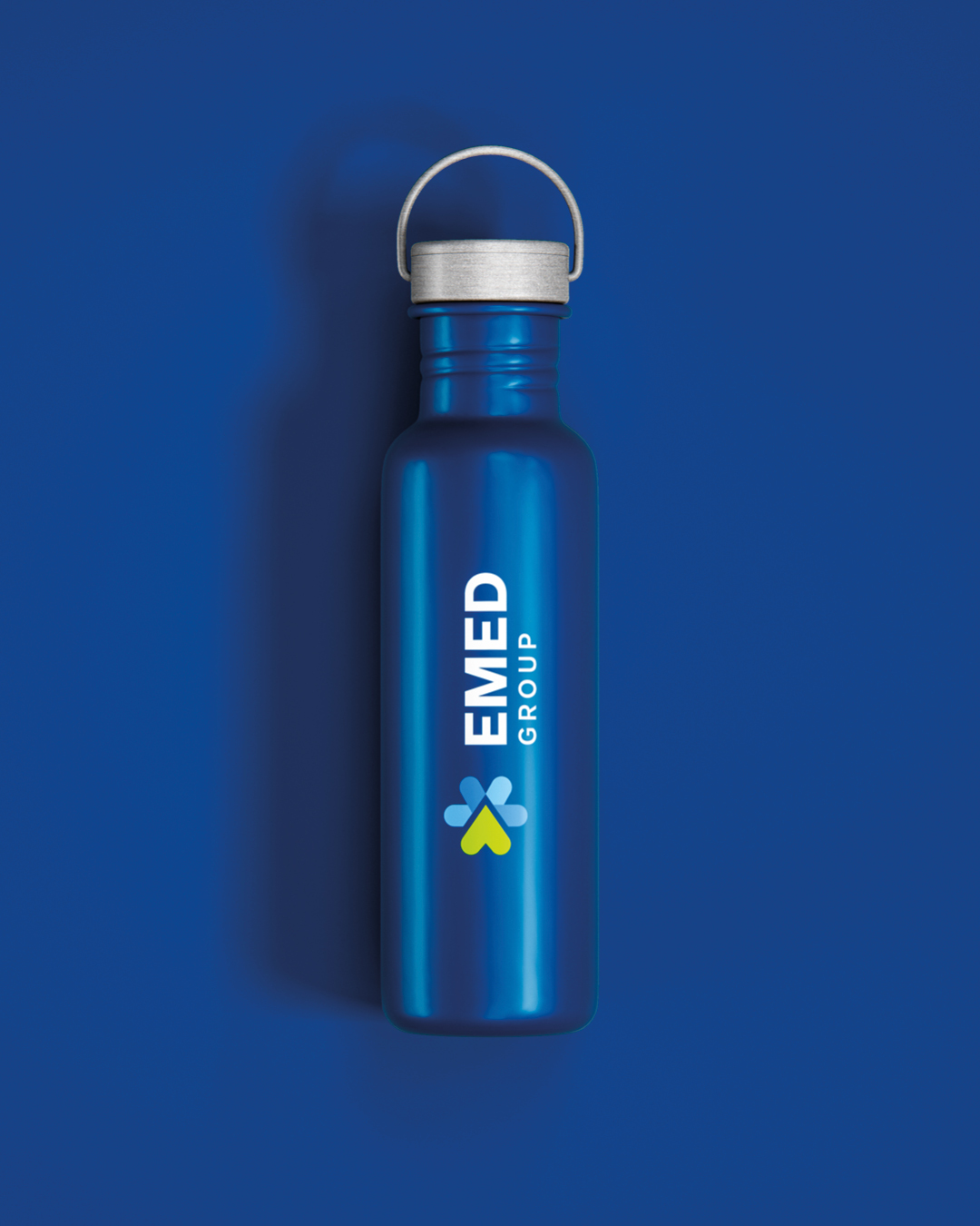
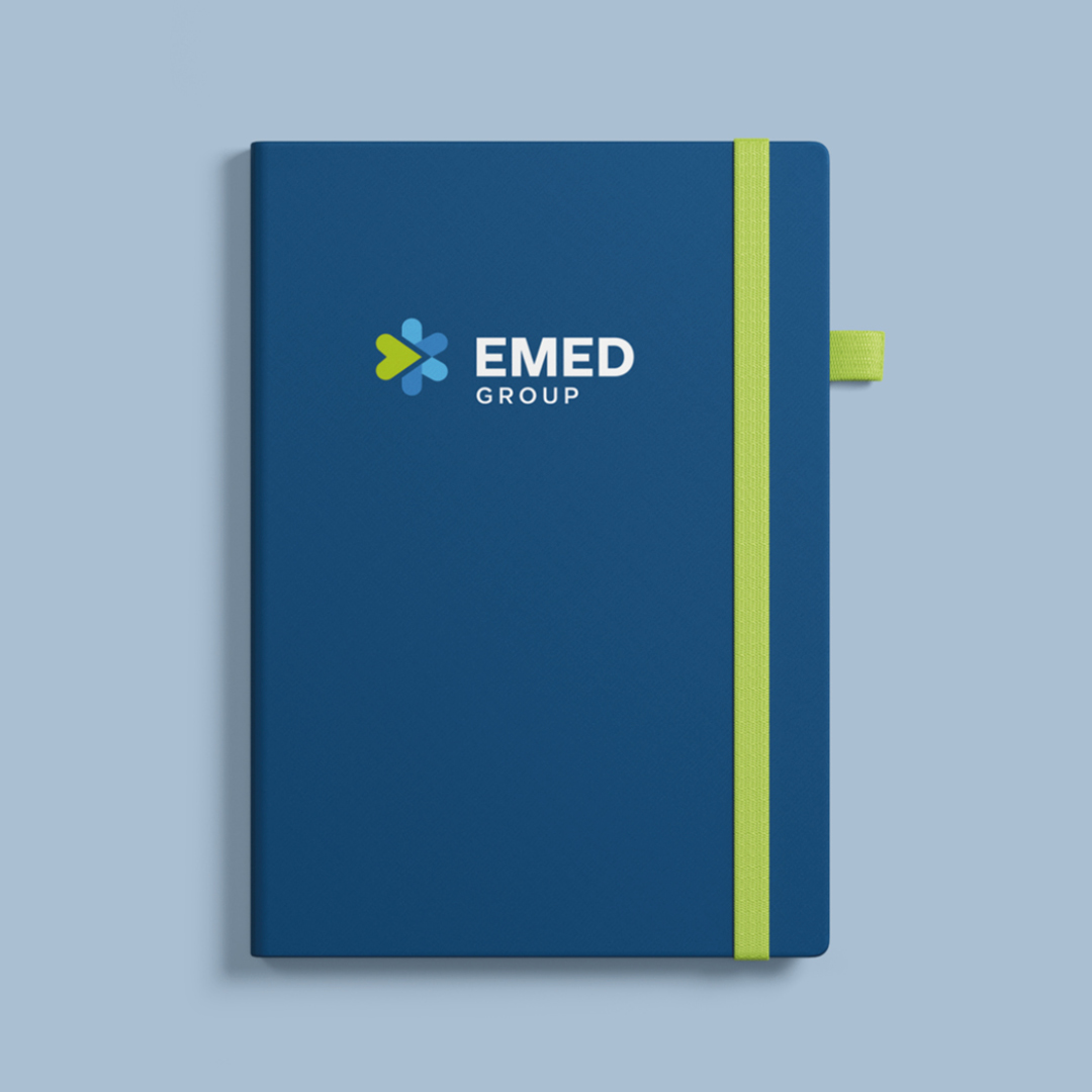
The outcome was a comprehensive and very well-received rebranding, including the development of detailed brand guidelines.

We are actively implementing this new brand across various channels, effectively communicating the unified vision and values of the merged entities.

left green arrow
right green arrow
4
emed-group
Greg Fox

Greg Fox

Head of Marketing, Communications & PR

EMED Group

“It’s refreshing to work with a professionals who consistently deliver fantastic workfirst time, every time. Their work not only meets but often surpasses our expectations, ensuring that the final product is not only visually stunning but also strategically impactful. I wouldn’t hesitate to recommend them and I frequently do."
EMED Groupemed-group
EMED GROUP

Designed to scale.

GET IN TOUCH